Thursday 15 December 2011

5th December 2011

   I have now drawn out a rough layout of my magazine on paper. I know that I want to use a long shot of Amy, however, I have not decided which picture to use. I have started creating my double page spread on Serif DrawPlusx3. By having a play around with photos on the layout I can see what works and decide which pictures to use. Once I decide on a concept I will be able to write my article to go with it.

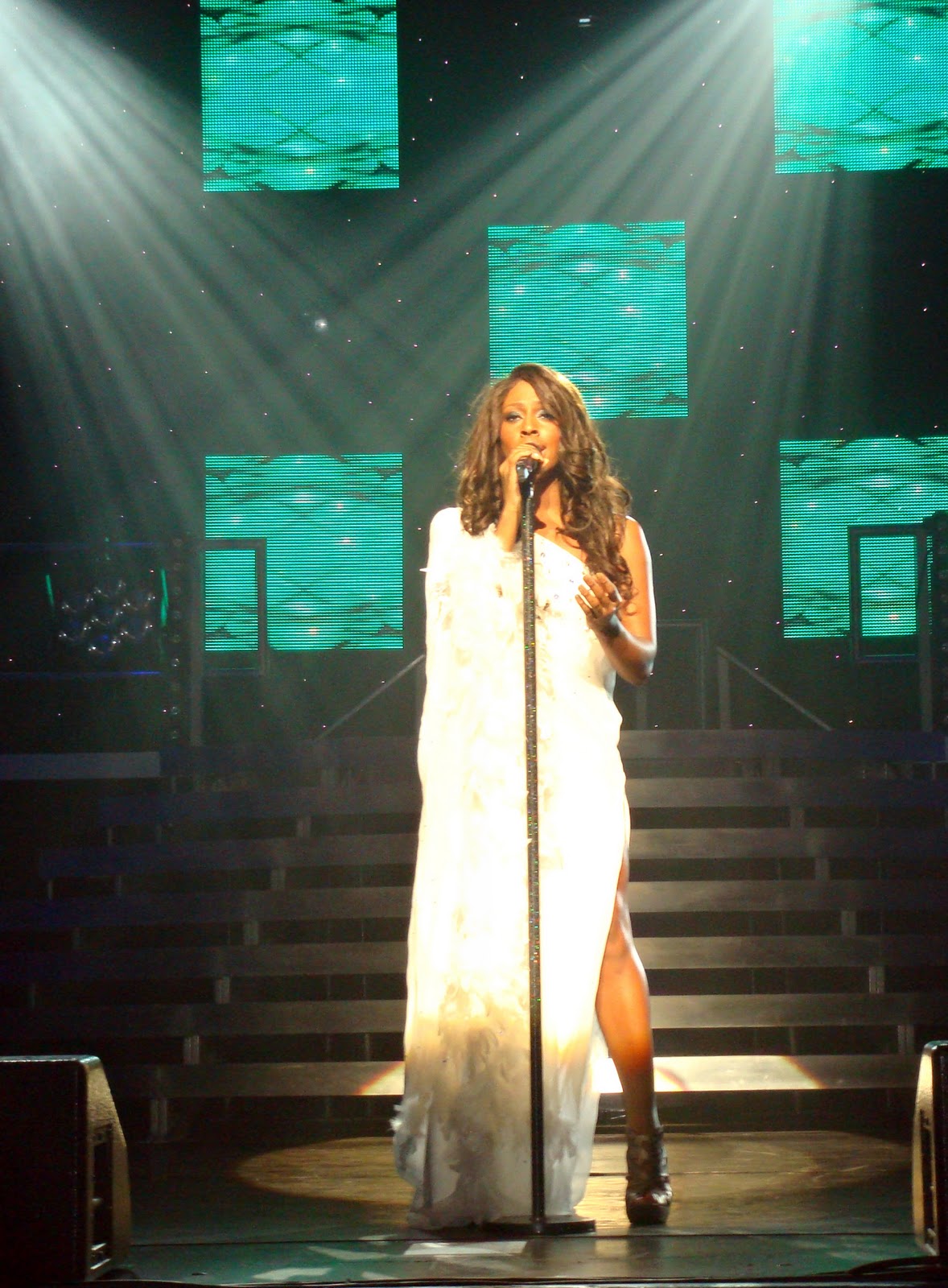
I have decided that I am only going to use one photo in my double page of Amy. I have chosen to use the photo shown on the right as I particularly like the over-the-shoulder pose and by having one leg raised shows off the shoes more. I think that the pose will appeal to both genders as it is slightly alluring, however not overly provocative. With the outfit she is wearing, I have decided to go for a Chicago theme with the double page spread as I feel that the clothing and pose would go well with this concept. I have so far given the pages a black background and written the artist, Scarlet Hudson's name across the top of the page in red. I have chosen the font 'Beatnik SF', a font which was used on my cover and for my contents page.


Monday 12 December 2011

2nd December 2011

   I have now looked at two double page spreads from Q Magazine. The first is an article on Amy Winehouse, after passing away. This article features over 14 in pages in the magazine due to its great importance. It contains an unseen interview and comments on the star made by other artists. This double page spread is taken from the third and fourth pages of the article. Similarly to the Rihanna article in Company, a picture has been used which takes up an entire page. However, this picture is on the right page and overlaps onto the left.   
   Another quote is used as the main point of focus for the left page, this time reading 'I'M NOT A HORRIBLE GIRL'. This statement takes up the majority of the page and is written in a bold black font. The bold black font compliments the 'in-your-face' attitude of the statement. The background colour of the left hand page is white as this makes the black text easier to read and gives the article a more sophisticated appearance to appeal to the target audience. Below the quotation features an introduction into the interview. In this introduction the artists name, Amy Winehouse, has been written in white, upper case letters and features in a black box to make it stand out.
   The left page has a small version of the magazine logo in the left corner alongside the page number and issue date. The right page does not have these features due to the picture, however, it does have a sentence of information as to where the photo was from and who it was taken by.

   This next article appears in the same issue of Q Magazine and features an article on the cover stars Kasabian. This double page spread appears half way through the article and so has the text continuing from another page. The left side of the page consists entirely of the article. The text has been arranged into three neat columns which give it a mature and educated appearance. As the article is an interview it shows what the interviewer is saying as well as the artist's response. The questions by the interviewer are written in a bold font, to distinguish a difference between who is talking for which part of the article. The start of each response by the artist begins with 'TM:' which is the artists name (Tom Meighan) and is written in red. This is done to emphasise the difference between who is talking. The same red is used as the magazine logo which makes the word stand out and seem more important. In the centre of the page a quotation from the article is used. This is written in upper case, and has a bold red font to gain the readers attention. This is something which appears to be common in magazines where an interesting statement is picked out.
   The right page features a small sub article about the same artist titled 'TOM MEIGHAN'S WORLD OF MONSTERS'. This page features the only photo of the artist on the double page spread, a full shot of Tom Meighan gripping the back of his head with his hand. This page has more of an informal layout with playful fonts which compliment the theme of the topic. There are several illustrations which appear around the page, which have a child like appearance, again to go with the theme. I particularly like the full shot being used in the centre of the page with text laid out around it. However I think I want my page to look more sophisticated like the left hand page.


1st December 2011

   I have now looked at several double page spreads in existing magazines to get an idea of the layout and codes and conventions. The first I have looked at is from Company Magazine.
   This double page spread is an article about the pop superstar, Rihanna. The first two things which catch your eye are the main image of Rihanna, which takes up the whole of the left page, and a sentence which crosses over the two pages in quotation marks. The quotation marks immediately indicate that this is something which has been said by whom the article is featured on. This entices the audience into wanting to read more by giving just a short quote. The text is all in upper case to make it stand out more and has a bold pink and black font colour. The pink stands out well as the rest of the page is black and white. The black has been used against a white background so that it contrasts and again makes it bolder. The black font colour has been used only for the word 'MY', perhaps to emphasise that this is her life she is talking about. As this feature has a fairly long article, it has been spread out over four pages instead of cramming it into two. Therefore, the whole article does not feature on this double page spread. Having read the article it seems that the quote 'I LOVE MY CRAZY LIFE' fits well with it as Rihanna's interview begun with them going on a wild goose chase to find props and costumes for one of Rihanna's concerts as one of her tour buses had been involved in an accident.
   There are several pictures of Rihanna over the two pages. The main photo is a medium close-up shot of Rihanna looking down and smiling. The image takes up the whole of the left side of the page and is in black and white. On the second page there are various different shots of Rihanna having make-up applied. These feature in rows, similarly to a film strip. These photos are again in black and white and trail off the page, cropping some of the photos. These goes with the 'crazy' and perhaps even disorganised feel of the article to match the interview. It also show a more behind-the-scenes view of the artist and indicate that the interview is more in-depth and involved. These images appear on an angle which aligns with the quote and the first part of the article.
   The article is introduced with a small amount of information indicating what topics are going to be covered in the article. This is positioned away from the article, between the photos and the quote. Despite this, the reader will know to look at this first as it appears higher on the page and the larger font will attract the attention first. The actual article then begins in the bottom right corner. The article begins with a large speech mark which is the same colour pink as the quote. This follows by the article which uses a smaller, plain black font. The text finishes on mid sentence as it reaches the end of the page and so a small arrow is used to indicate that the article continues over the page.
   The left page does not feature a page number ad there is a picture which covers where it would appear. However the right page does have a page number in the bottom right corner. The issue month and the magazine website appear alongside. In the top left hand corner the word 'celeb' has been written. This is to indicate what type of article the feature is. This article would appear under the 'celeb' sub-heading in the contents page.
   I very much like the sophisticated layout of the magazine and the use of clear fonts which make the articles easy to read. I think that the pictures work well together along with the text. I don't think that I want to have a whole page taken up by the photo as I wish to show more of my article.

Saturday 10 December 2011

29th November 2011

   I now feel I have finished my contents page. After all of the pictures were inserted I felt that I could improve the pages as I had something to work around. I have changed the title's font to 'Accord Heavy SF', the same font used for 'Tunes' on the masthead. I feel that this font is more sophisticated and looks more professional on the page. Below the page title, I have placed the magazine masthead in a small white circle. I done this so that the page is branded and the identity of the magazine is emphasised. I have also included the issue number below this. I have arranged the codes and conventions of the double page spread into sections, separated by black lines.
   The first column on the left hand side, sectioned by the sub-heading 'Features', is where the main articles and interviews with artists are shown. These all give the page number of the article, the name of the artist and a snippet of information about the feature to entice the reader to find the page. These are arranged neatly in a column to give a more mature appearance. The features fit alongside the picture of Amy Winehouse, taking up the same length of the page, again giving a neat layout.
   The section below this includes a regular feature of the magazine, 'MyReview'. This article is something which will appear in each issue of the magazine and allows a member of the public to write a review on a current music topic such as a new album or concert. For this month a JLS fan has reviewed their new album. This goes along with the photo of JLS which I have put on the page.
   The left hand column on the right page features three images and a special offer to subscribe to the magazine at the bottom. I have arranged the photos so that they alternate between colour and black and white to make them stand out more.
   The far right column, sectioned off with the subtitle 'Review', consists of different reviews in the magazine. These again give a page number for where to find the review, either the name of the artist of the name of the review and a small amount of information. I have placed the picture of Josh and the album covers below the text and made the picture big enough so that there are no blank spaces. I have placed page numbers at the bottom of the magazine along with the issue date and the logo on the inside corner.
   I feel that the contents page is well branded with the logo appearing three times over the two pages. The three fonts used are both used on the front cover to continue the magazine's identity over the pages. Each subheading is written in upper case letter to make them stand out more and have a box around them. These boxes are the same colour blue as used on my cover and in my masthead title. I have used the 'My' feature of the title in several regular features, 'MyReview' and 'MyTop20' to again keep the magazine well branded with regular items. I believe that my contents page looks sophisticated and will appeal to both genders as I wished it to.


28th November 2011

   I have now decided to use the cover with Francesca on as my main front cover instead of the picture of Amy as I felt that the photo looked better on the cover and would appeal to both genders more. Also as my contents page and double page spread contain photos of Amy I wanted use more of a variety of different people within the magazine.
   I have now used a different picture for the cover of the different issue of the magazine to go in my contents page as a feature to subscribe to the magazine. I have used one of the photos which I took for the cover of my preliminary task of my sister, Hayley. I have decided to use one of these photos as I had a variety of different shots of her and the previous issue is for October. As these photos show her styled as a vampire I feel that they would appropriately fit onto the cover. I have chosen a picture which shows her peering over a fan as I feel that this picture would appeal to both genders, showing a slightly alluring pose.

   I have edited the photo using Picnik. I have firstly removed and imperfections in the skin using the 'blemish remove' tool to give the skin the more perfect look of a pop star. I have then used the 'vampire eyes' tool to give her yellow eyes and the 'draculon dermis' tool to give her skin more smoothness like a vampire. I have used the 'black and white' effect to make the fan black instead of blue as I feel this is more appropriate and makes the photo seem darker. I have then increased the contrast and the sharpness of the picture to make it more professional and eye-catching.
   I have then replaced the picture of Franky with this one, changing the main plug to 'Niomi Hunter "new album, new look, new me"'. I chosen a name which I feel sounds like a pop star and have used a short quote which I feel would entice the reader into buying the magazine. I have then inserted the previous issue into my contents page in the same place where it was previously.


Wednesday 7 December 2011

25th November 2011

   I have taken more photos for my contents page. I have this time asked a friend, Josh, to model for me. I decided that I needed another photo of a male artist to balance the page out and keep the unisex image. I have taken a range of different photos of Josh in two different outfits. In the first photos, I have gone for an old-fashioned meets new trend image. Josh has been styled in red skinny jeans, a British flag T-shirt and a military-style grey jacket. Josh also wore aviator style glasses, an array of wrist bands and a scarf hanging out of his back pocket. I feel that this combination gives off the image of a music star, however, I feel that he does not look like your typical pop star and perhaps more of a pop/rock genre with the skinny jeans and the scarf in the back pocket. The jacket I feel is very Michael Jackson and gives that old fashioned feel. However I feel that it also looks modern due to the recent military fashion trends. The red colours of the jeans, scarf and T-shirt compliment each other and the sunglasses give people an instant connection to a pop star. I have chosen to use the photo shown on the right as I particularly like the angle and the pose in it, giving a laid back image with his hands in his pockets.
   I have then taken more photos of Josh in a different outfit. I have decided I am going to make an album cover for Josh to go with the other image. This album cover will have a photo of Josh on it. For this outfit I have chosen to go for darker styling to give off more of a rock image. Josh has been fashioned in with a black scarf draping over one shoulder and a silver chain over the other shoulder in the opposite direction. This I feel gives almost a Roman or Greek appearance. I have chosen this as I feel that many music stars push the boundaries in there styling and so wanted to go for something different. I have also got Josh to wear eye-liner to emphasise the rock look. I have taken the photographs in the evening whilst it was dark and have set up lamps around the room to make the lighting more dramatic. I have asked photographed Josh from different angles, directing him with a variety of different poses. As I particularly like the two photos shown to the right I have decided to put two album covers on the page, a normal and a deluxe edition. I feel that these will equal out more with the other photo of Josh.
   I have edited the three chosen images using Serif DrawPlusx3, increasing the contrast and the sharpness. To make the album covers I have firstly drawn out two black squares using auto shapes. I have then inserted the pictures and cut them out using the cut out studio. I have then drawn lines around the pictures, some in front of the images and some behind. I have changed the brush effect to 'smoke' and maximised the thickness of the lines. I have then coloured these lines white to make them contrast with the image and the background. I feel that these make the album cover look more dramatic and compliment Josh's styling. I have named the album 'SoundStreet' and have written the album name at the bottom of the covers. I have used a red font with a glass effect on it to make it stand out against the image. I have written 'deluxe edition' on the second cover overlapping the album name to distinguish the difference. I have come up with the name 'Alex Rider' as the artist's name and have placed the name on the album cover also. I have changed the transparency of the black square to a brick textures as I feel that this goes with the album name 'SoundStreet'.

   I have now inserted the photo and two album covers into my contents page in the bottom right corner. I have cut out the first photo of Josh and placed it on the right of the space. I have then placed the album covers at contrasting angles on the left of the other photo, one slightly behind it and the other overlapping. I have added a white glow to the three pictures to make them stand out more.


24th November 2011

   I have now decided to put a picture of Amy in my contents page. I have looked through all of my full shots and chosen one which I feel will fit well on the page. I have decided the use the photo shown to the right as I want the image to go between the Alexandra Burke and Jessie J pictures. As Amy is not standing up I feel that this photo will fit nicely between without covering the other images to much. I am going to cut the background out of this photo so that it will overlap the other images without having an unnecessary background hiding some of the other photos. I think that it will also look good using a variety of different photos.
   I have tried to cut this image out using the cut out studio on Serif DrawPlusx3, however I found that some of the green still remained on some of the edges. Due to this I have firstly edited the photo using Picnik. I have used the black and white effect over the areas of the background which were not cutting out very well. I have then used the boost effect over the black and white to make the colour crisp white. I have done this around the photo so that not green remained around the areas which it was left after the attempted cut out. Whilst on Picnik I increased the contrast and the sharpness of the image. After the edit, I cut the image out again and found that this worked perfectly.

   I have now inserted the photo into my contents page. I have decided the position it behind the Jessie J picture but in front of the Alexandra Burke photo. As the photo is cut out it only overlaps the photo slightly and so doesn't take your attention away from it. I have added a white glow around the photo of Amy to make her stand out more so. I have also placed a number on the photo to show where the article will feature. I feel that I am happy with this column now and think that the colour photo of Amy looks good with two black and white photos.


20th November 2011

   I have now taken more photographs for my contents page of my friend, Francesca. I have chosen Francesca as she is photogenic and has fairly tanned skin which will compliment the look I am going for with her photos. I have gone for edgy styling with Francesca, almost giving her a warrior queen look. She wore a patterned gold dress with a black high waist belt. She has styled her hair with two chunky plaits on either side of the face, a quiff at the front and the rest hanging in loose curls. For accessories I gave her a black wristband around one wrist and a belt and bangles around the over. I also wrapped a chain around her hand and between her fingers. I believe that combined these give the image of a pop star. I have chosen for Francesca to not wear any make up as I felt that the natural look complimented the warrior image.
   I have taken several images of Francesca from different angles. I have asked her to pose with her hands on her hips and straight faced to give more of an attitude image. I believe that by doing this the photos will appeal to both genders as the pose is bordering on sultry and so will appeal to men and women may aspire to be like her for her fashion. I have chosen to use the photo shown to the right as I feel that it is the best one. I think that the photo looks better with her eyes looking at the camera and the over the shoulder angle is much more effective.
   I have edited this photo using Picnik on Picasa. I have put a faint sepia effect over the image to enhance the warrior-like feel. I have then increased the contrast of the image and sharpened it to make it look more professional and eye-catching.
   I have used this photo as the previous issue of 'Mytunes' before the one which I am creating. I have decided to this as I wished to show a subscribe feature in my contents page which will show a special offer. This is something which the magazine, 'Q' features in its contents pages. I have decided to show a previous issue as I did not want too many photos of Amy on my contents page and I intend to use another elsewhere on the page. I have used a similar layout to my main front cover, however, I have changed the plugs to feature different artists.
   I have now inserted this cover into my contents page at the bottom left column of the right page. I have shown a brief snippet of the offer, 12 issues of 'Mytunes' at half price. However I have given a page number to show where in the magazine to find out more about the offer.


Tuesday 6 December 2011

22nd November 2011

   For another of of my images in the contents page I am going to use a photo from a JLS concert which I went to as I feel that some of the pictures came out well. Also I thought it would look good on the page to again use a photo of a real artist.
   JLS again fit the genre of music for my magazine perfectly and they also have several hits currently in the charts. For this reason I feel that they would go perfectly in my magazine and I did notice them in other magazines when doing my analysis. As they have had a new album released this month, I have decided that there article would be a review of the new album. This feature is something which I found was popular in other magazines.
   I have looked through my photos and chosen the best one, shown to the right  I have chosen to use the picture at the bottom as it was my favourite shot. This is because it shows a full shot of each member of the group. I also like how they are in action, singing, and all show different poses and are looking in different directions. I particularly like the background also and feel that it makes the group stand out.
 I have inserted the photo into my contents page at the bottom left column of the first page. I have placed a number in the corner of the image to indicate where in the magazine the article is located. I have made this article as a review by a fan of the artist, a regular feature which I wish the magazine to have. I have chosen to have this as a feature as I feel it ties in with the USP of the magazine, showcasing information for everyone, 'Mytunes'. Therefore I feel that a review by a reader and a fan of the artist would be something which my target audience would want to read. I have called this feature 'MyReview' and have given a subheading for this section.

19th November 2011

   I have now taken more photos for my contents page. As I again wanted pictures of celebrities I have used pictures of my drawings.
   I have chosen to use pictures which I feel are the closest I have to looking like black and white photos. I have edited both pictures using picnik on picasa. I have coloured over the copyright on the Amy Winehouse portrait and my signature on the Jessie J portrait using the 'Doodle' tool as they have a block colour behind them so I could simply colour over it. I have removed the signature on the Amy Winehouse portrait using the 'Retouch' tool so that it would not look obvious that something had been removed from this spot.
   I have also chosen these artists as they are both currently big topics in the music industry, Amy Winehouse because of her recent sudden passing and Jessie J because of her domination of the charts over the last year. Therefore I feel that these artists would create appropriate features for the month's issue.
   I have put both these artist's names on the front cover as they are an important part of this issue. I have inserted the Jessie J portrait into the left hand column on the right page and the Amy Winehouse picture on the left page. I have chosen to make the picture of Amy Winehouse the biggest on the page as I believe it will be the most important article in the magazine after the main cover story.


18th November 2011

   For a photograph in my contents page I wish to feature a celebrity. I have pictures from an Alexandra Burke concert which I went to. Alexandra Burke is a singer who fits perfectly into the genre of music of my magazine. With the X Factor being popular at the moment, I feel that an article on a previously successful winner would be very appropriate. As I have photos of her singing at her concert I have decided that her article will be a review of her concert. As this is her first concert, I will emphasise this fact and make the article appear exclusively to the magazine. This will encourage people to buy the magazine more so if they are interested in the particular artist.

     I have gone through all of the photos and chosen the best ones. I have decided on the photo shown to the right as I believe that the angle and pose in the photograph are very dramatic and captivating. I have edited this photo using picnik on picasa. I have decided to change the photograph to black and white as I feel that this makes it more effective, making the picture look more professional. I have then increased the contrast and sharpened the photo to give it a better quality. This article was also featured as one of the more prominent plugs on my front cover as I feel that it is one of the more important features.  
                                                                                                            
    I have now inserted the photo into the contents page. I have placed it in the left hand column of the right page. I have cropped the photo at the sides so that the photo has little background and the readers attention should no be diverted. I have placed a number at the top right of the photo to indicate which page the article will feature. I have used a white font for the page number so that it stands out against the dark photo.

Saturday 3 December 2011

14th November 2011

   I have now started looking at the contents pages of several existing magazines to get ideas for the layout of my own.
   I have again looked at the magazine 'Billboard' to see how their contents page is laid out. The page is divided into different sections. The left shows a column, scaling the length of the page, which shows the music chart for that week, a feature of the magazine as it is a magazine for the charts in the USA. To the top right of the page is the title 'Contents' which is shown in a bold font in upper case, to make it stand out. The page then features the contents of the magazine in a list of short bursts of information to show what these pages are about. These are all numbered so that the reader can find them. These contents are split up into sections on the page with various sub-headings to categorize them. These sub-headings, along with the lines used to decide up the page, have the same blue colour as in the masthead title on the cover. This blue appears to be used on all the contents pages of Billboard. This has been used as it creates a sense of identity for the magazine, making the reader know that it is the same magazine.
   These particular contents pages each show four images. Three of which have been lined up below the title and another larger image appears below. Each photo represents an article within the magazine and features a number on so that the reader knows where the article is. Instead of just having writing on the contents page, pictures are used as the grab the reader's attention, more so than text. For some magazines, a photo may be used in the contents page alongside text. However, others such as this one show only the photo. The pictures show a variety of different shots of different people. This makes the page look more interesting and makes each individual picture stand out more.


   I have now drawn out a rough design for my contents page on paper. I have decided that I want it to be over two pages as I feel that it would be too compact to fit onto one page. I want to use at least four diverse pictures at various different sizes over the two pages. I have decided to go for a layout similar to that if Q Magazine as I feel that it is very sophisticated and appeals to both genders. 
I have created a rough layout of the contents page on the computer using Serif DrawPlusx3. The left page so far consists of the title 'Contents' in bold lettering and a column down the middle left hand side with a larger picture next to it. At the bottom there will be a smaller photo on the left and the information to go with that photo next to it. The second page of the contents will feature more images in the upper left hand column and more feature s alongside on the right. At the bottom there will be a feature to subscribe to the magazine at a discounted price and I have not yet decided what will go at the bottom right of the page.