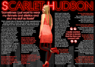
Now that I have all of the necessary features on my double page spread I have now enhanced the appearance of it. I have used the colour select tool on Serif to pick out the red of the dress in the photo. I have then changed the font colour of the questions asked in the interview into the selected red. I have chosen to do this as I feel that it makes the questions look much clearer and more distinguishable from the answers.
I changed the font colour of the title 'Scarlet Hudson' to black and have added a red glow around it to make it look more like the 'Chicago' title. In contrast to this the 'S' and the 'H' have a white font colour with a red glow to make each word stand out more similarly to the 'C' in the centre of 'Chicago'. I have also used the white font with the red glow for both quotes to make them clearer to see and to enhance the theme throughout the page.
 I have placed an arrow at the end of the text on the page as the whole article does not fit on the two pages. This is something which I found articles in existing magazines do when the article continues onto another page. I have used an arrow from the auto shapes, however, I have cropped off the tail so that it is just the triangle part. I have made the arrow a similar height to the font and have line it up with the text. The arrow is also white with a red glow around it.
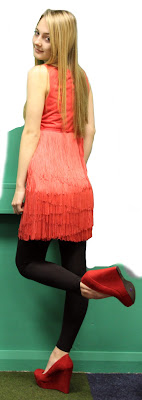
 I have faded the buildings slightly to make the article clearer to read as I thought it would be more difficult with the heavy contrast of the buildings. Similarly to my contents page, I have drawn around the photo of Amy again in white using picnik. I have done this as I found that you could still see green around certain areas of the photo. I have gone around where the green was still present and then cut the photo out again using the cut out studio on Serif.
 I have decided to place a glow around the photo to make it look like the light is shining off her. I have done this by copying and pasting the image and placing it on top of the original photo. I have then taken the transparency of the fill down to 0% to make it completely transparent, allowing you to see the original photo below. I have then edited the line by giving it a red glow.

No comments:
Post a Comment