I have started looking at music magazines currently on the market. I have found a new magazine titled 'We Love Pop.' Which has only just launched this summer and is currently on its fourth issue.
I bought the magazine to have a look at it to analyse. Despite being a fan of pop music and the people who feature the on the covers of this magazine, I felt embarrassed going up to the counter to buy it because of the female appearance of the magazine. This again made me think that there should be pop magazine which appeals to men also.
This magazine appears to be aimed not only at women but at a younger audience of teenagers. This is suggested from the playful masthead the use of a heart instead of the word 'love' itself. The bold colour schemes of the magazine also appeal to younger girls along with teasers such as 'breakfast with bieber (in his boxers) nom nom' and 'plus a ton of reem boys - JLS, One Direction...' will appeal to young girls.
Despite being a fan of the music of artists featured on this magazine cover, the 'text talk' language used in the plugs and the clear appearance of a female gossip magazine would put me off buying it.
Having read the articles within the magazine I have found that the majority of them are extremely short. I found myself thinking 'Is that the end of the article?' as many didn't even manage a couple of paragraphs. Even the cover girl, Tulisa's article only had two pages worth of an interview. This shows that the magazine is aimed at a younger audience perhaps with a shorter attention span. The questions asked only touch slightly on her music career but are more based towards X Factor gossip, for example 'Do you keep snacks under the desk?' and 'Have you been flirting with Gary Barlow?'. Despite being a fan of the X Factor these aren't really thigs that I'm particularly interested in knowing and but would like to hear more about what she's doing with her solo album etc.
This has made me decide that I would definatly like my magazine to contain some lengthy articles you can 'get your teeth into' which are more about the music instead of the gossip.
Despite not being a particular fan of this magazine, there are some factors of it which I think would be good for mine. I am particularly fond of how the colour scheme of the magazine changes with each issue. Also I like how the colour of the masthead title matches the lead article, to show it is more important and stands out. However, I think that the other plugs should be in a different colour.
Monday, 31 October 2011
Friday, 21 October 2011
18th October 2011
We have now practised analysing existing music magazines in class. I had a go at analysing the magazine 'Rolling Stone'.
The title of this magazine, 'Rolling Stone', immediately makes a clear link to the type of music which the magazine represents. This is because people instantly link it to the famous rock band, the Rolling Stones. However, the title also indicates that something is always changing, in this case, the content of the magazine. The masthead is placed across the top of the magazine so that it can be clearly seen on the shop stands. The masthead of this magazine is slightly covered by images and plugs. Despite this, the masthead is still recognizable as the magazine is very popular and the font is original to it.
This magazine always uses the same font for the masthead, however, the colour sometimes changes. In this issue, the font colour for the masthead is orange. This matches the colour of the main plug font to the bottom left. This immediately shows that the plug is important and makes it stand out from the other plugs. This is done as it is the main highlight of the particular issue of the magazine.
The image on the front of this issue is of the band, Pink Floyd, indicated in the main plug. The photo of the band members has been changed to sepia. This has been done as it suggests a previous era and shows that they are an older generation band which will perhaps appeal to a more mature audience. Behind the image are flames rising up. The fire compliments the main font colours and also links in with the rock image and suggests a hot topic. The band is described as 'Legendary' in the plug. This indicates a high status and shows their success. A picture of a pig overlaps the masthead. As I am not a fan of Pink Floyd, I did no know what this was for at first, however, I have now discovered that it is from one of their album covers.
I would say that the target audience for this issue in particular is for older generations because of the band on the front cover. However, I believe that the target audience very much depends on who is on the front cover. As shown either side are issues of the magazine which feature younger artists, Rihanna and Justin Bieber, who appeal to a much younger generation than Pink Floyd. This shows that the magazine is versatile and has a wide target audience which can change with different issues. Despite the artists Rihanna and Justin Bieber being of a pop genre, the magazine has made them look more of a rock style in appearance. For Justin Bieber, he is wearing a leather jacket and vest and has been styled with a wild messy hairstyle. Rihanna is wearing a casual outfit with rips in her hot pants and rocks a tangle of red mass of hair. For these issues, the masthead font colour is red. This is the colour which is used in the majority of the issues of the magazine as it instantly links to the magazine music genre, rock. Each issue of the magazine appears to have a politically related plug. For example on the Pink Floyd issue, one plug reads 'New Clues to JFK'S Murder?'. This again shows that this magazine is targeted at a more mature audience. Also this plug gives a conspiracy theory which may appeal more to men. Therefore the magazine may be more targeted at men. I would say that in appearance, the magazine is not at all feminine. However I believe that women would also buy this magazine if they found an appeal from the front cover but perhaps not every issue.
On this issue, the main image and the main focus of the front cover is Amy Winehouse. The masthead colour, pale blue, again matches the main plug 'Amy Winehouse' as to draw attention to it. Although it seems like an uncommon colour to link with a rock magazine, the rock colours of red and black have been used within other plugs on the front cover. Also as Amy Winehouse is not a rock artist, the colour still works. The light blue also matches that of Amy Winehouse's bra strap shown in the photo.
Alliteration has been used in the main plug, 'Diva' and 'Demons'. This makes the sentence sound more catchy when read out and makes the words flow more. The rest of the plugs go around the photo and only overlap it slightly as to not take the focus away from the photo. The red and black used for the font stands out well against the white background so that they can be easily read.
I would say that this photo of Amy Winehouse is quite intense with her head looking down but her eyes looking straight at you and therefore grabs your attention. Her clothes again match the rock image, a vest top with the bra strap slightly showing gives off the care-free look. This also shows off her many tattoos which again match the theme of the magazine.
Thursday, 20 October 2011
14th October 2011
I have decided to go with the name Mytunes. This is because it rhymes with a computer program which is currently the most popular for storing and downloading music. Therefore I feel it is current and has a clear link to music. Although I intend to create a pop magazine, I feel that the genre of pop has expanded dramatically in the last few years and it is often difficult to put a specific genre on some music. Therefore, my magazine will cover 'pop music' but perhaps also elements of R&B, Dance, Rap, Hip-Hop and Rock. Due to this generalised genre I feel the name 'Mytunes' represents what the magazine will be, as it will have something for a wide variety of people. The magazine will include interviews with pop stars but will be more about the music instead of more about the gossip. I feel that by doing this it will appeal men but will still keep the interest of women. Therefore I intend to make sure the magazine has a unisex appearance and is not biased towards a particular gender. I want the magazine to have a sophisticated appearance but to still look modern. The magazine will be made to appeal to older teenagers and above.
13th October 2011
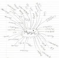
I have drawn out a mind map for the main task so that I have an idea as to what I need to do. I have brainstormed the word music to see if it would help me come up with names for my magazine. So far I have come up with 'Live 'n Loud' and 'Mytunes'.
11th October 2011
I am now moving on to the main task. For this we have to produce the front page, contents and double page spread of a new music magazine. We must use entirely original images and text and must use at least four images. I am currently thinking of doing a magazine based on pop music. This is because it is my favourite type of music and there is not a magazine currently on the British market which I find appealing for this music genre. There are many magazines aimed at women which interview pop stars, however, these are targeted directly at women and are often filled with gossip such as who the pop star is dating etc. and not about the actual music. Therefore I think there is a gap in the market for a magazine based around pop music, with articles about the music which would be made to appeal to both men and women. I now need to think of a name for my magazine.
Friday, 7 October 2011
30th September 2011
I have now completed the mock-up for the contents page of my school magazine as part of the preliminary task. I have used the same font and colour for 'Contents' as used for the title on the front cover and the same for 'October' as the rest of the text on the front cover. I have done this so that you can see there is a clear link between the front cover and the contents page do that the magazine is recognizable. I have again used bats from the Serif DrawPlusx3 gallery behind 'October' to again give the Halloween feel to the magazine. I have faded the bats out so that the writing still stands out against them. I have included the title of the magazine 'The Jotter' at the bottom of the page.
I have again used the lines across the page to give the effect of lined paper to link in with school and have once more faded them out so that they do not take over the page.
The contents page would consist of three images which relate to the articles shown on the front cover. A number is shown on the image to show which page in the magazine the article features.
Where I have written 'text text text' would be where the contents listings would be shown. Having looked at other contents pages of existing magazines I have noticed that the contents page does not show what is on every page, as many pages are taken up by advertisements, but just the main articles and features, therefore I have not included each page number in the list.
Tuesday, 4 October 2011
27th September 2011
I have now completed the front cover of the magazine. I improved the design by moving the picture across to the left to allow more space for articles at the right of the cover. I have also made the picture bigger so that the articles don't take all the attention away from it. I have rotated the bar so that it is straight along the bottom, again to allow more area for other articles. I have added the article 'Take a look! Winners from our spine chilling vampire art competition!'. I have included words from the lexical field of Halloween, 'hair raising' and 'spine chilling', to enhance the theme through language. I have also used these words as they make the articles more eye-catching and interesting. I have removed the bar code as I realised it would not be necessary for a school magazine. I have taken a look at the magazines 'Glamour' and 'Company' to make my magazine look more like those already on the market. These magazines are aimed at a similar target audience to my magazine, teenagers to young adults. I have arranged the articles around the picture now, similarly to those I have looked at. Some of the articles overlap onto the picture. I have also changed the colour of some of the text in the articles to make them stand out more and make it more interesting. I have used the same orange which I used in the bar to compliment the Halloween theme. I believe that the use of orange makes the magazine appealing to both genders as it is a fairly unisex. I have inserted a white bar behind 'October 31st' and 'Take a Look!' to make them stand out more against the background. I have used white as it contrasts with the black font. I believe that although the image is of a girl it still appeals to men and women and the vampire image fits in with the current trends of the media. Therefore I feel this will appeal to a wide variety of people.
Subscribe to:
Posts (Atom)